Matplotlib Explained
What is Matplotlib?
- Matplotlib is the plotting library (visualization) for Python
- Matplotlib useful for exploratory data analysis and scientific plotting for publication (e.g. machine learning, statistics, etc.)
- Matplotlib produces high-quality graphics which can be customized for resolution, size, plot type (2D/3D), figure type (PNG/SVG/TIFF), and mathematical notations
- Matplotlib can be easily integrated with Jupyter Notebook
- Matplotlib has large community support
How to install Matplotlib?
# using conda (make sure you have installed conda https://docs.conda.io/projects/conda/en/latest/user-guide/install/#installing-in-silent-mode)
conda install matplotlib

# using pip
pip install matplotlib
Visualizing data using Matplotlib
Histogram
# you can use interactive python console, jupyter or python code
# I am using interactive python console (Python 3.6)
import numpy as np
import matplotlib.pyplot as plt

# randn generates data from standard normal distribution (mean=0 and std dev=1)
data = np.random.randn(10000)
fig, ax = plt.subplots()
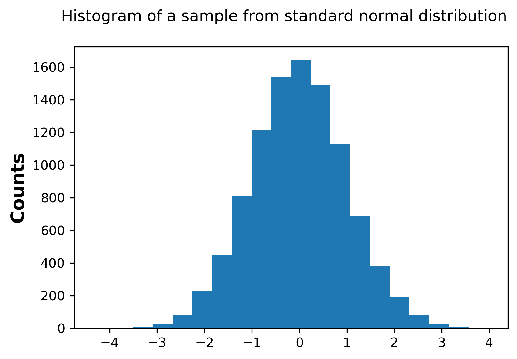
ax.hist(data,bins=20)
fig.suptitle('Histogram of a sample from standard normal distribution')
ax.set_ylabel('Counts', fontweight="bold", fontsize="14")
# provide tick positions
ax.set_xticks([-4,-3,-2,-1,0,1,2,3,4])
plt.show()
# to savefig on file (you can specify format and resolution here)
# plt.savefig('hist.png', format='png', bbox_inches='tight', dpi=300)
Generated histogram by above code,
Scatter plot
import numpy as np
import matplotlib.pyplot as plt

x = 2*np.random.randn(5000)
y = x+np.random.randn(5000)
fig, ax = plt.subplots()
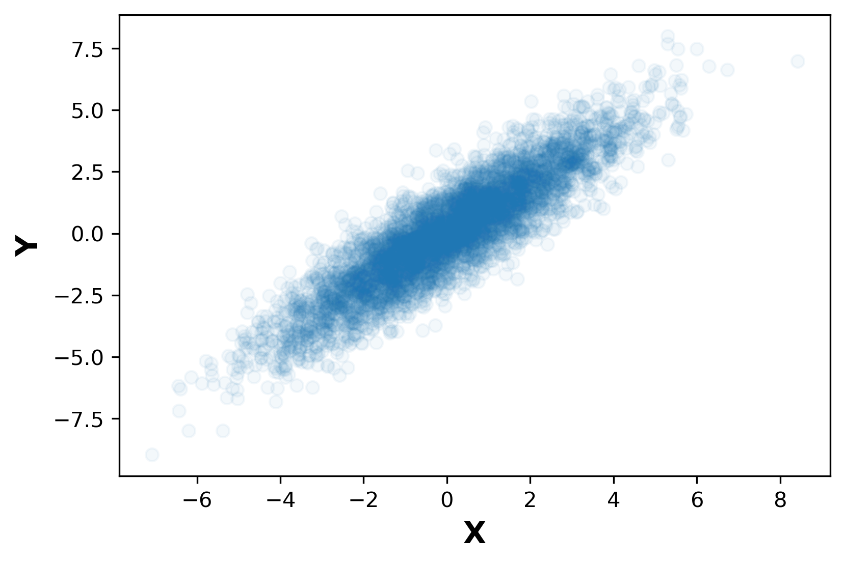
ax.scatter(x,y,alpha = 0.05)
fig.suptitle('Scatter plot')
ax.set_xlabel('X', fontweight="bold", fontsize="14")
ax.set_ylabel('Y', fontweight="bold", fontsize="14")
# provide tick positions
# ax.set_xticks([-4,-3,-2,-1,0,1,2,3,4])
plt.show()
# to savefig on file (you can specify format and resolution here)
# plt.savefig('scatter.png', format='png', bbox_inches='tight', dpi=300)
Generated scatter plot by above code,
3D Scatter plot
Visit this link to see how to create 3D graphs
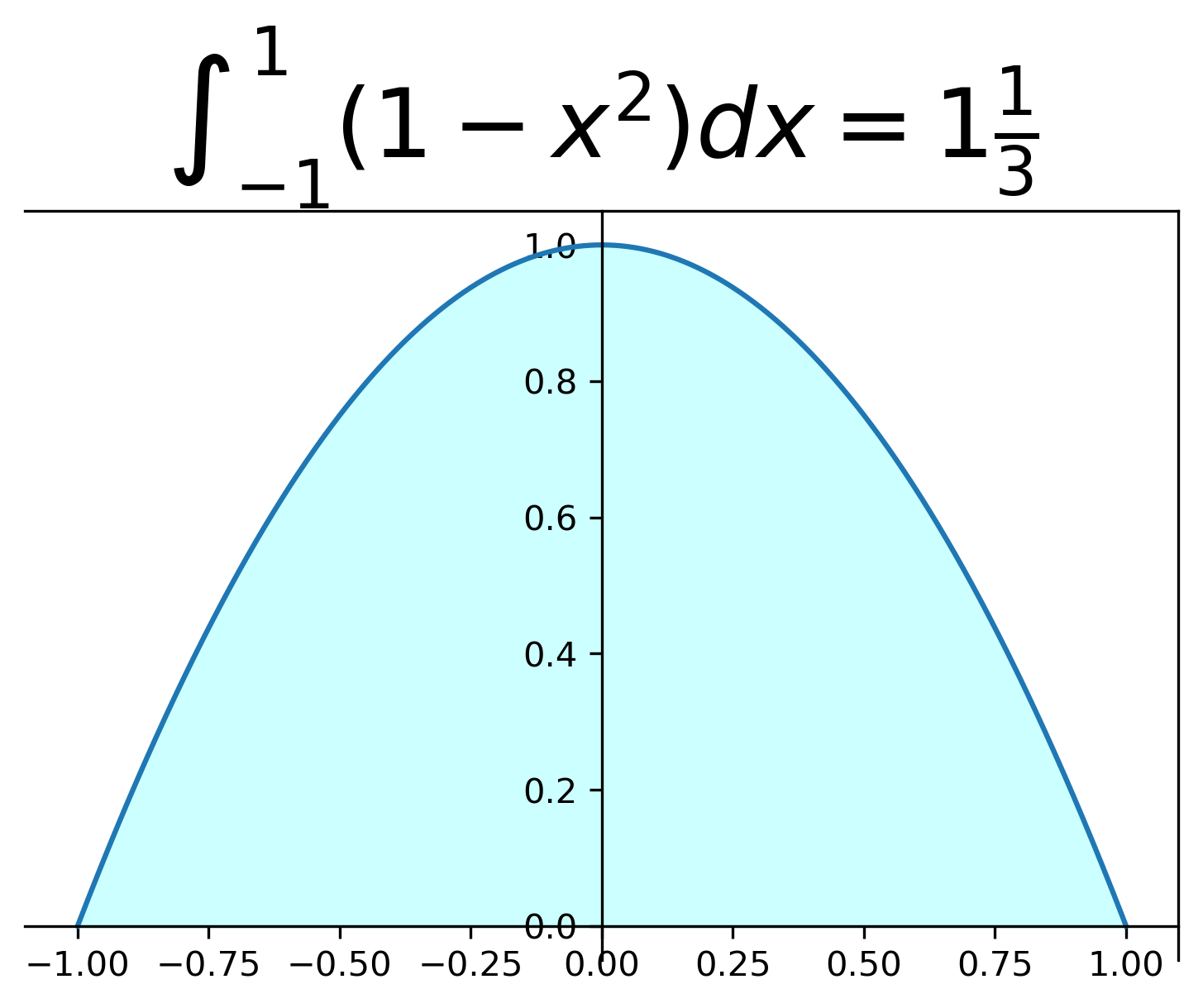
Plots with mathematical notations
import numpy as np
import matplotlib.pyplot as plt

x = np.linspace(-1,1,1000)
y = -x*x+1
fig, ax = plt.subplots()
ax.plot(x,y)
ax.fill_between(x,y,alpha=0.2,color='cyan')
# pass y axis through 0 on x-axis
ax.spines['left'].set_position('zero')
# origin of y axis at 0
ax.spines['bottom'].set_position('zero')
fig.suptitle('Scatter plot')
ax.set_xlabel('X', fontweight="bold", fontsize="14")
ax.set_ylabel('Y', fontweight="bold", fontsize="14")
# render latex formulas in the title
ax.set_title('$\\int_{-1}^{1}(1-x^2)dx = 1\\frac{1}{3}$',fontdict={'size':28})
plt.show()
Generated line plot by above code,
This article is modified version of original article appeared on Kite


